ShopDreamUp AI ArtDreamUp
Deviation Actions


Description
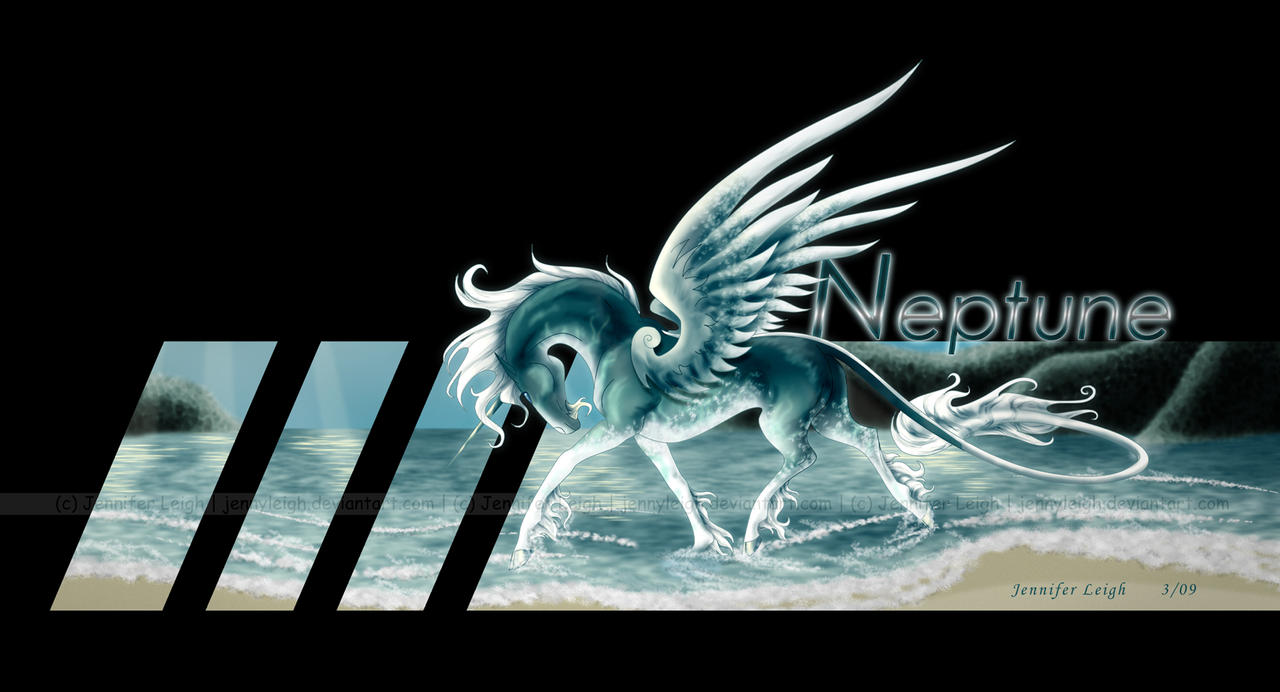
LOOK AT THIS PICTURE!! I am SO gawdamned proud of this thing!!! Look at the coloring!!! *swoons* The background could be a bit more refined... but whatever... mmmmmmm
*pets the horsey* you are my precious... yes you are... pretty pony....
The main subject is slightly stylized. All anatomical "errors" were on purpose. The emphasis was flow, not perfection.
This is 1 of 3 water gods I made... I'll upload the other two later... but this one is still my favorite. *huggles* The coloration is inspired by dolphins... how they are darker on top than bottom.
*this* picture makes me think I'm ready for commissions...
Image size
1800x973px 538.55 KB
© 2009 - 2024 jennyleigh
Comments72
Join the community to add your comment. Already a deviant? Log In
Lets try this critique again (my second one, yay ^_-)
Firstly I want to say that I'm really impressed how this drawing turned out. Overall Impact is like a strike with a hammer <img src="e.deviantart.com/emoticons/b/b…" width="15" height="15" alt="
Pose of your horse god is sooo delicate and your stylization in some places only added him (or her) more grace. Maybe it's because I just really like your style, or maybe you're getting better and better in that what are you doing. White and blue colours, like these on dolphins were a nice choose for this char
...the sea now. I just love the waves and this soft foam... <img src="e.deviantart.com/emoticons/h/h…" width="15" height="13" alt="
In the end one word about the composition. This black area with stripes of 'real' bg looks really unique... and I like it <img src="e.deviantart.com/emoticons/n/n…" width="15" height="15" alt="